Mix Master - UX CASE STUDY

Teach by playing! 

The MixMaster app by Sonical.ly is primarily a gaming app with the added benefit of educating users in music production. Its unique combination of gaming and education provides music practitioners at all levels with a means to create music while helping them progress in their learning.
sonical.lyMixMaster

The Challenge

Our goal for this project is to find ways to enhance the store experience throughout the app and design digital assets that will continuously draw users to the game and retain their interest.

There were five designers on the team, and my role consisted of researching, participating in interviews, analyzing the data, creating the wireframes and contributing to the design of the user interface.

Research Plan

Our goal will be to understand current pain points, both in the gameplay experience and shopping experience, and to see how introducing user flow at the store level will affect the app's overall usability. To do this, our research will include the quantitative and qualitative methodologies mentioned below.
• Primary Research
   - Exploration Questions
   - User Surve
• Personas
• Heuristics Analysis
• Competitive Analysis
• Usability testing of the current app
• Usability testing of New Prototype App 
(new store experience, using lo-fi mocks)

Primary Research

Exploration Questions

• How might we improve the store experience?
• How might we includethe purchasing user flow seamlessly into the game user flow?
• How does the gamification enhance the music education?
• How can we entice users to make purchases throughout the app?
• What are the current pain points of the checkout/store experience?
• How might we motivate users to continue playing on the app?
• How might we prevent users from getting frustrated and giving up during game play?
• How does a user learn music creation through gamification?
• How can the app introduce rewards in order for users to have a sense of progression in learning and gaming?

Who are the end users?

• Casual Gamers
• Gamers 
• Music Listeners
• Music Creators
• Producers 
• Gen X

Which are the end users' needs?

Simple & Intuitive
Digestible UI
Comprehensible game mechanics
Sense of Progression
Discernable path forward
Increasing in difficulty
Fulfilling learning/game objectives
Incentive
Pushing users to keep playing/learning
Enticing reward system

Actionable Insights

• Universally recognizable game components
• Logical organization of hierarchy of info
• Following a cohesive design theme throughout the game
• Adding Sound Design for components
• Adding recognizable goals & checkpoints with a reward system
    - Mission/objective status bar
    - Progression chart for each unit
• Reward System
    - Daily Check-in rewards
    - Weekly/Monthly mission objection completion rewards
• Exclusivity
    - Limited edition items
    - Seasonal gaming/learning passes

Competitive Analysis

Competing apps

• Yousician
• Groovepad
• Beatstar
• Music Maker JAM

Aspects Evaluated

• Visual design
• Branding
• Gameplay
• Store experience
• Overall flow

Recommendations

Learning UX

• Provide instructions and/or tutorial videos.
• Allow users the chance to practice using each aspect of the game setup before playing.
• Make the game easier to start, then gradually increase the difficulty level.
• Provide an in-depth creative experience and/or tool.
• Provide tutorial videos featuring real people.
• Supply instructions and/or tutorial videos.
• Allow users the chance to practice using each aspect of the game setup before playing.
• Make the game easier to start, then gradually increase the difficulty level.
• Provide an in-depth creative experience and/or tool.
• Provide tutorial videos featuring real people.

Learning UI

• Provide visual cues such as colours, sounds or effects to show whether users are doing the right thing or not (or how accurately they are doing it).
• Add home page that users can easily navigate through and customize their experience from.

Learning Game

• Allow users the chance to practice using each aspect of the game setup before playing.
• Provide more affordance in the game setup.
• Give the users a sense of accomplishment from the beginning of the game so that they are incentivized to continue playing.
• Start out easy and then gradually build the difficulty level, reinforcing users’ sense of progress and accomplishment.
• Add suspense or competition to make it more fun, thus further incentivizing users to keep playing.
• The acquisition of “hitcoins” could allow users to unlock a more varied palette of sounds or more aspects of a real mixing board. This variety should start early on and then build as they progress.
• Have the user specify their genre preferences when they first join the app.
Personas

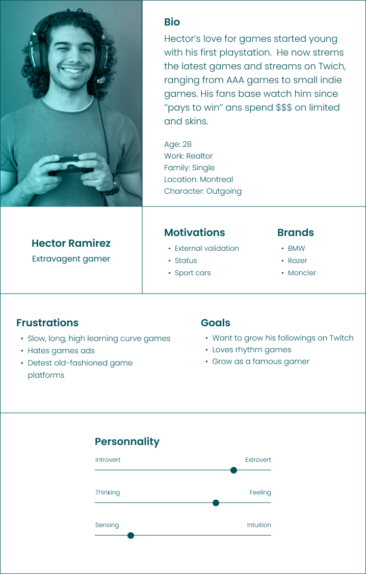
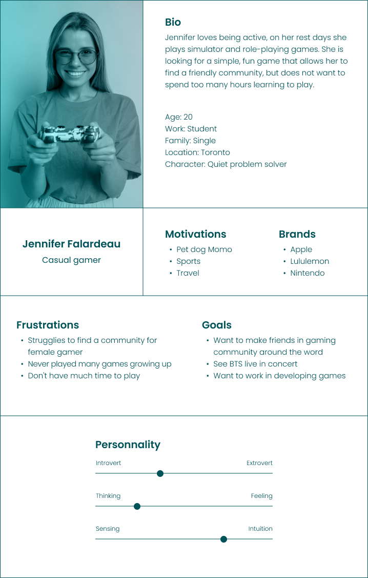
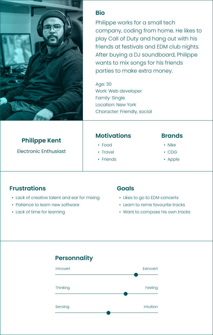
MixMaster users range from gamers to music producers. In order to get a better understanding of the application goal and user motivations, we built personas based on our research.

User Flow

Test and test!

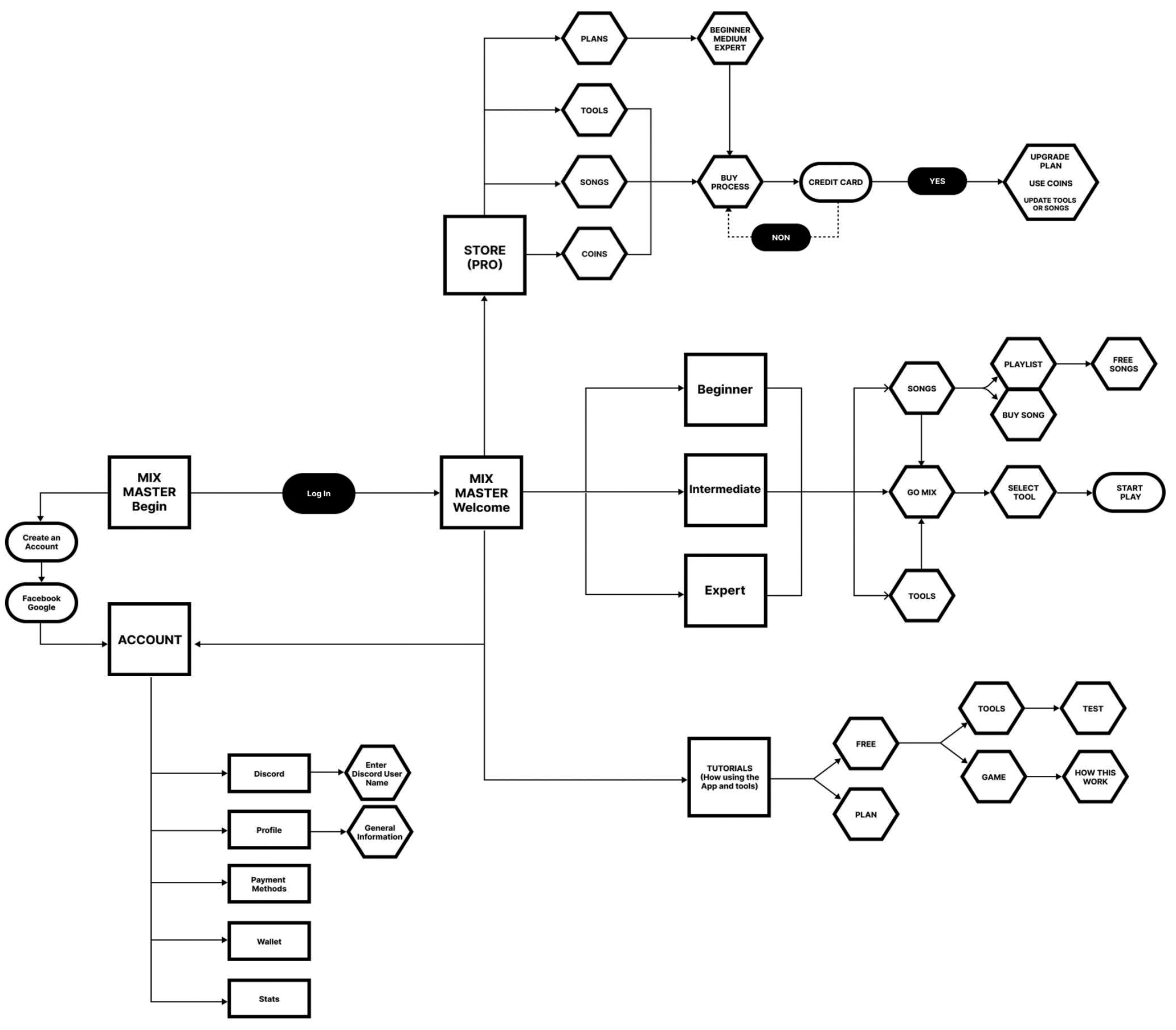
I mapped this first user flow to understand how users feel when interacting with the application. 
Identify some elements that I describe below:
- Some items, such as the store, account, stats, and tutorials, are hidden in the menu.
- Should there be an introduction page on the game?
- Sometimes, we feel breaks in communication about the steps to follow to have a more stable flow.
- Could the PRO button be on the store page?

DEFINE

Problem Statement

STORE

''A musician who feels disappointed because learning more skills needs to buy new credits but faces a system that just accepts bitcoins''

GAME

''A music student who feels anxious about learning new ways to create music needs to get to interact with the game but faces the interface is not very intuitive''

Wireframes

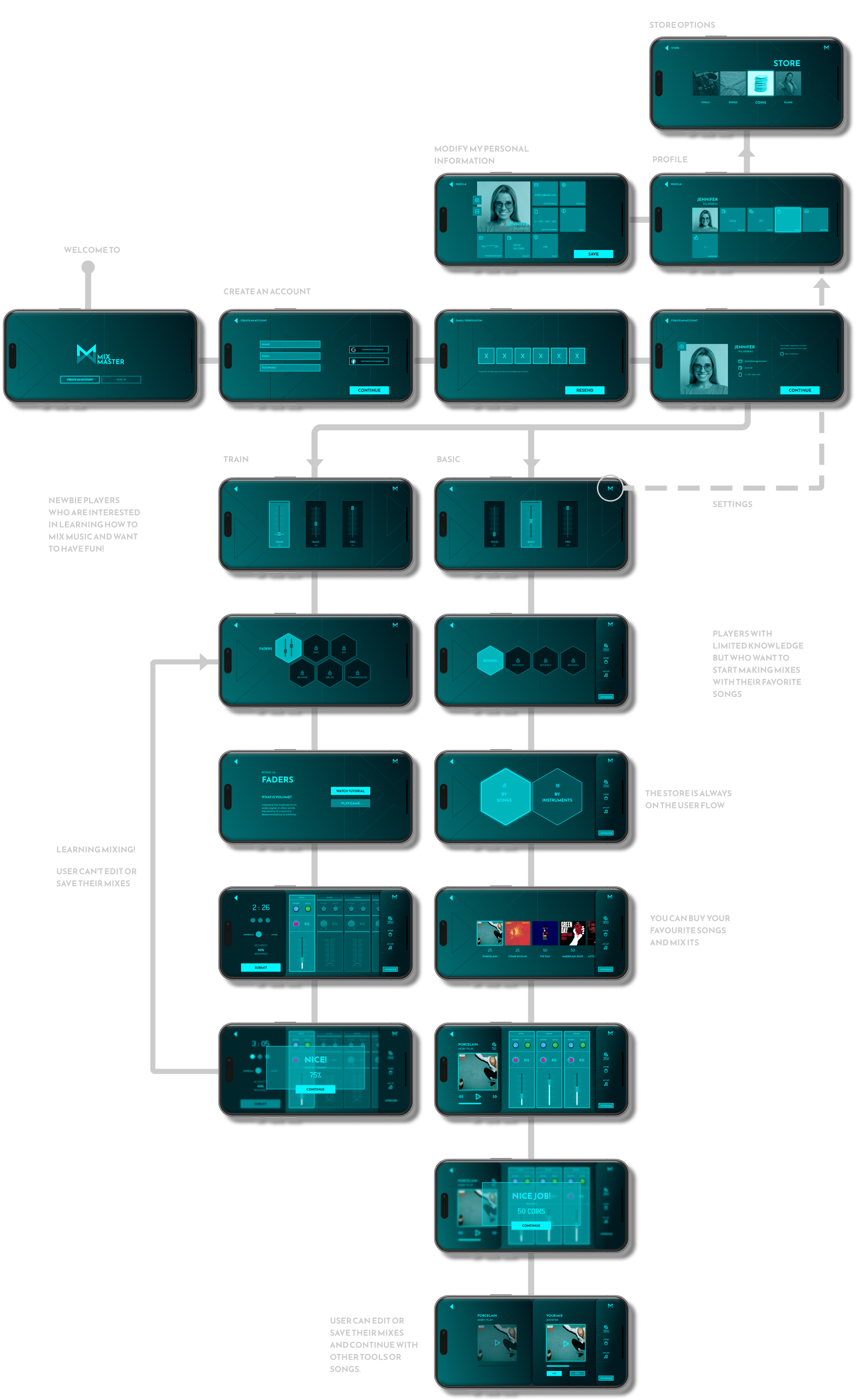
These wireframes exemplify our optimal solution proposition, prioritizing user-centric considerations and aiming for seamless objective attainment by streamlining unnecessary steps.
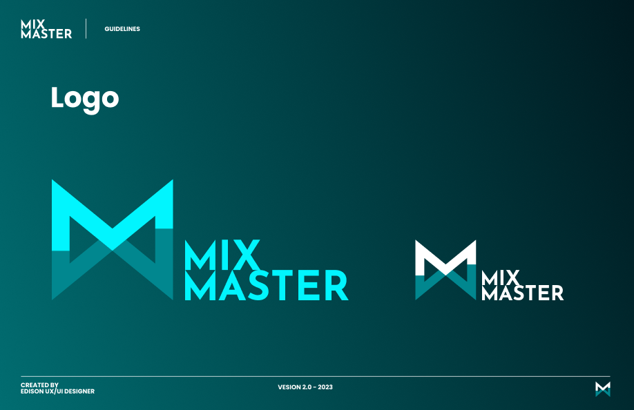
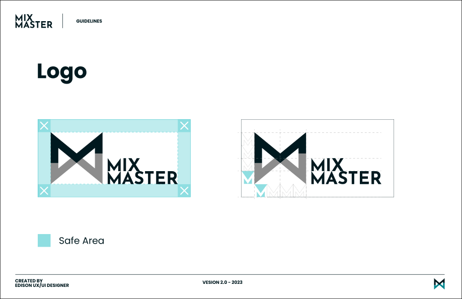
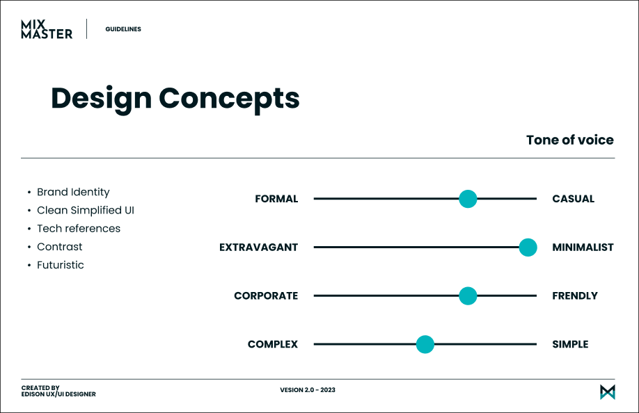
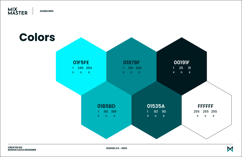
Guidelines
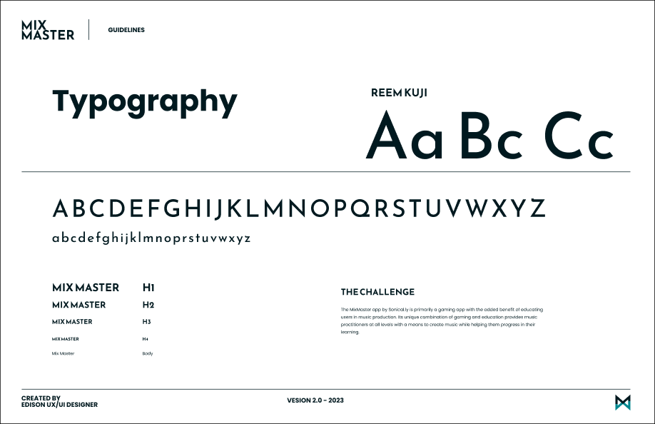
We present our graphic and user interface concepts that adhere to the highest standards of ergonomics and visual design, with the goal of enhancing the overall user experience.

High Fidelity Mockups

Usability Test

Through conducting these tests, we were able to identify certain aspects that necessitated enhancements, as well as others that necessitated a reevaluation, all with the aim of guaranteeing the application's usability and facilitating swift comprehension.

Task 1

Create a new mix

Open the app and create a new Mix.
Completed task
Did not completed the task
Misclick rate
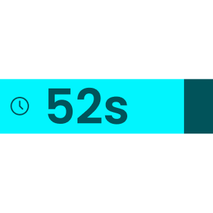
Average time

Task 2

Understand the tutorial

From the homepage, go to tutorial and go back to the mix page to begin the game.
Completed task
Did not completed the task
Misclick rate
Average time

Task 3

Go Pro

From the homepage, upgrade your plan and use your coins to enhance your mix.
Completed task
Did not completed the task
Misclick rate
Average time

Take away

When I think about gamification in UX, I see how game design elements can transform the user experience. By incorporating rewards, challenges, or achievements, I can motivate people to engage more deeply with a digital product. It’s not just about making the experience more fun, but about guiding attention toward key behaviors like loyalty or collaboration. However, I’m also aware that this requires balance; it’s essential that these elements don’t distract from the product’s main purpose or compromise its usability.

Next project 

Feel free to hit me up. 
I'm looking forward to hearing from you!

casallas.design@gmail.com

Montréal, Québec, Canada
2024 - Edison Casallas's UX Design Portfolio - Québec, Canada. All rights reserved