COSTCO - Heuristic Evaluation

About Costco App

The Costco Mobile App is the easiest way to save time and money on the go. Costco have completely re-thought their mobile app and made it easier for members to access the incredible values found only at Costco

The Challenge

Analyze the usability of the Costco application Following the Neilsen Norman Group’s 10 Usability heuristics and propose some redesign ideas.

Role

UX/UI DESIGNER
UX RESEARCHER

Timeline

40 Hours
2022

Tools

Pen and paper
Adobe XD

TASKS

Find out if the application offers all the necessary tools for a pleasant and intuitive navigation that allows users to make their purchases easily

1

Assessed usability and functionality of the app using the above hueristics

2

Proposed redesigns based on my findings

3

Recommendations to improve the interface

HEURISTIC EVALUATION

Below I will evaluate the elements that do not follow the established standards

9. Help user recognize, diagnose, and recover from errors

During the registration process, the system allows users to create an account, but after it requests them a membership number necessary to buy something. If the user doesn’t have a membership number, why can they create an account?

8. Aesthetic and Minimalism Design

The homepage has too many elements and products with different categories, colours, shapes, and typographies. That isn't usually enjoyable.

6. Recognition Rather that Recall

This menu has too many options, and after selecting one of the categories, it shows another window with another number of categories. Therefore, it is not very practical for the user to follow several steps to get to the product he is looking for and then remember the path if he decides to do it again.

4. Consistency and Standards

Some texts are not legible because they are minimal, and users with visual problems will have difficulty reading. Maybe they see the advertising, but some pieces of information are so small that they cannot be seen.

4. Consistency and Standards

Some texts are not legible because they are minimal, and users with visual problems will have difficulty reading. Maybe they see the advertising, but some pieces of information are so small that they cannot be seen.

7. Flexibility and efficiency of use

Costco Grocery products are mixed with other products which could be confusing for the user because this category has an extra cost or special condition.

8. Aesthetic and Minimalism Design

The homepage has too many elements and products with different categories, colours, shapes, and typographies. That isn't usually enjoyable

3. User Control and Freedom

There is no link or button to return to the previous page, and the Android undo button did not work, forcing the user to return to the homepage. It is frustrating, and it feels like it is wasting time.

9. Consistency and Standards

When you want to add a product to the shopping cart, the system asks for the zip code and then launches an alert indicating that the product is not available in that area.

SCREEN REDESIGN

Our analysis gave us important insights that allow us to propose some redesigns seeking to improve the experience with the application

Before

After

Create Account

Request, first of all, the membership number; if the client does not have a membership, at least he will know that if he has an account, it will only be to see the articles or buy online only and not all products.
That thus avoids his frustration of thinking about having wasted time.

Before

After

Menu

It builds a menu with category icons and texts because it is more user-friendly and makes recognition easier, avoiding the number of steps to find products.

Before

After

Costco Grocery

Create an exclusive window for Costco Grocery products that works horizontally. That can allow customers to have the alternative of selecting only these products that have special conditions.

Before

After

All pages

Create a button to return to the previous page that allows the user to return because maybe they did not find what they were looking for or made a mistake.

Before

After

Delivery

The system must default the postal code registered in the registration process and automatically launch the warehouses or areas where the product is available.

FURTHER RECOMMENDATIONS

Based on my heuristic evaluation, I recommend the following usability improvements.

High Priority

Aesthetics and Minimalist Design

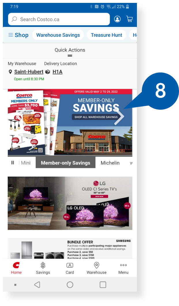
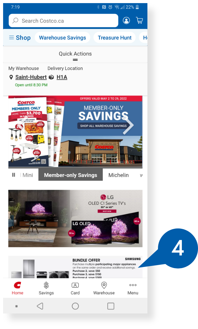
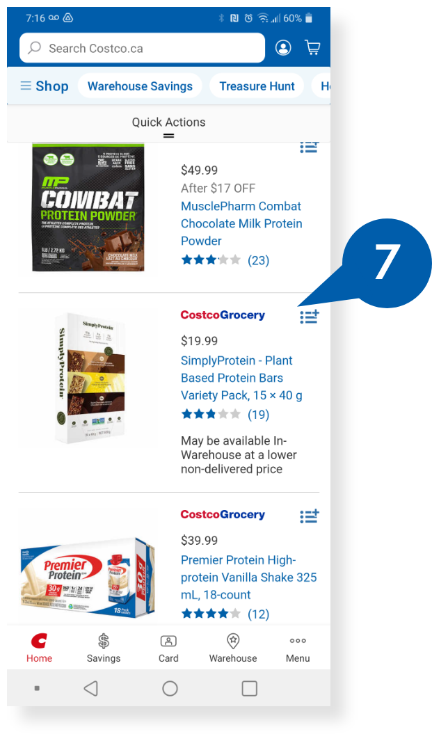
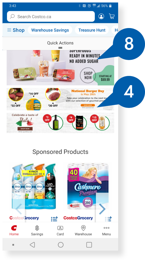
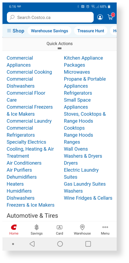
The homepage and other pages have too many elements, such as promotions, brands, forms, texts, fonts, images, etc., making navigation unpleasant. Creating a more defined graphic line with precise and efficient ergonomics parameters would be good.

Medium Priority

Flexibility and efficiency of use

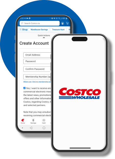
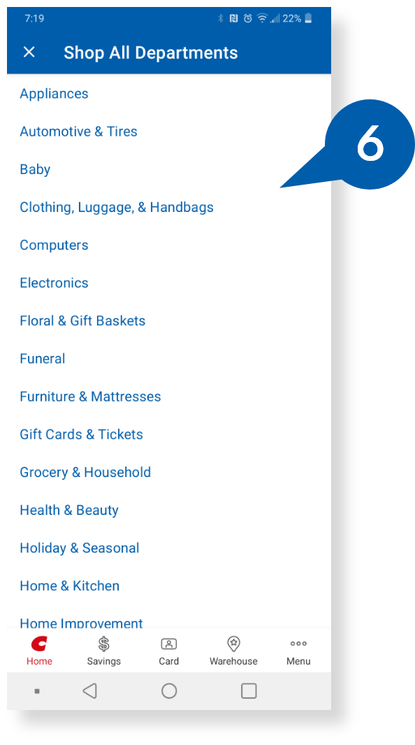
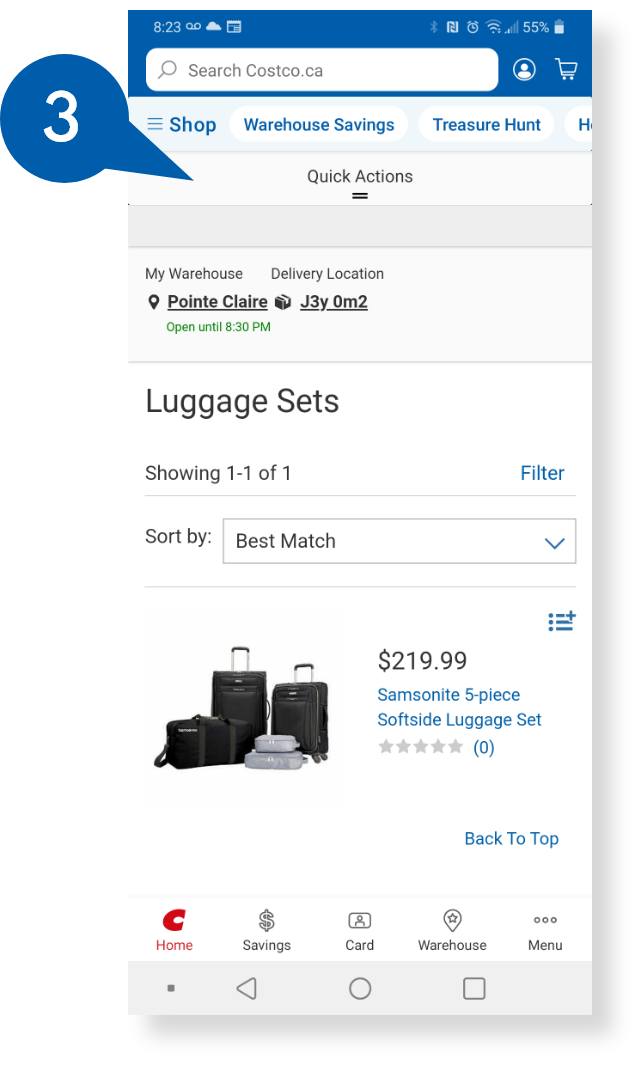
It is confusing to have two menus (Shop and Menu) and a space client. For example, if the user is looking for glasses, they will not find them in the "Shop" menu but in the other menu (Optical section). In addition, repeat categories such as Grocery and tires in both menus.
It would be better to develop a unique menu for buying like "Shop," It finds all kinds of categories, products and services and a user space with other types of information such as parameters, language, city, etc.

Low Priority

Match between System and Real World

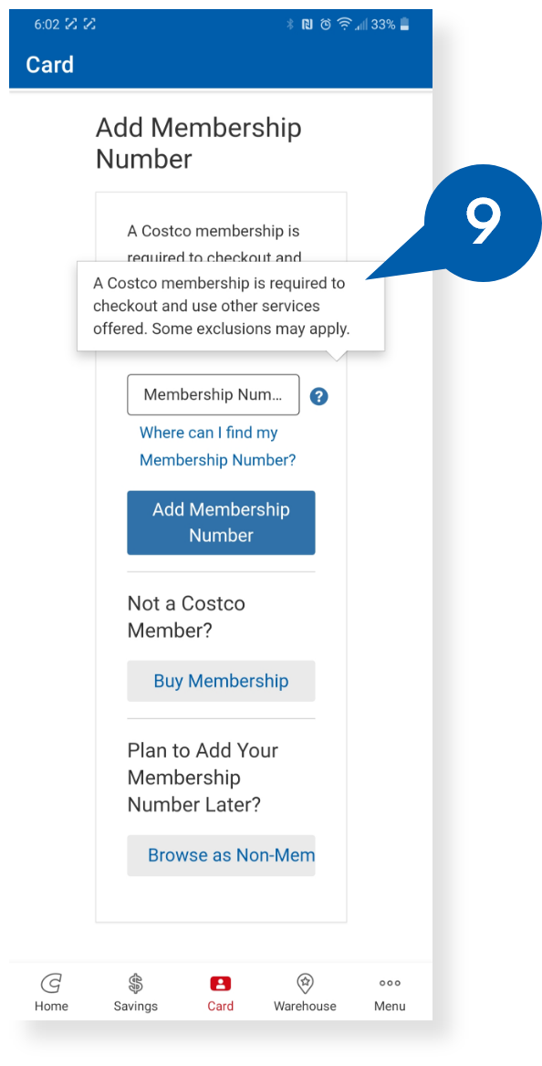
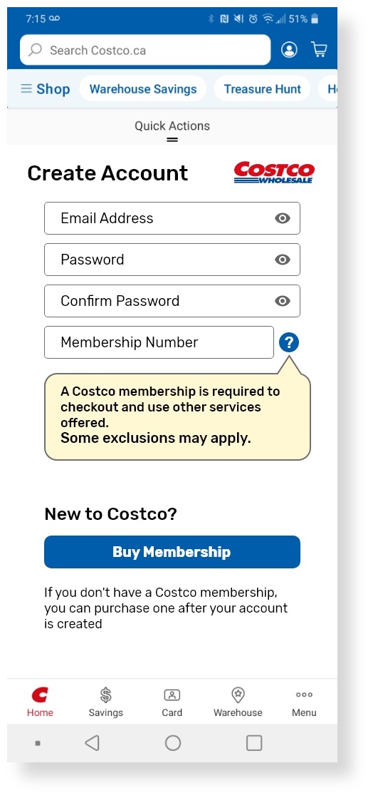
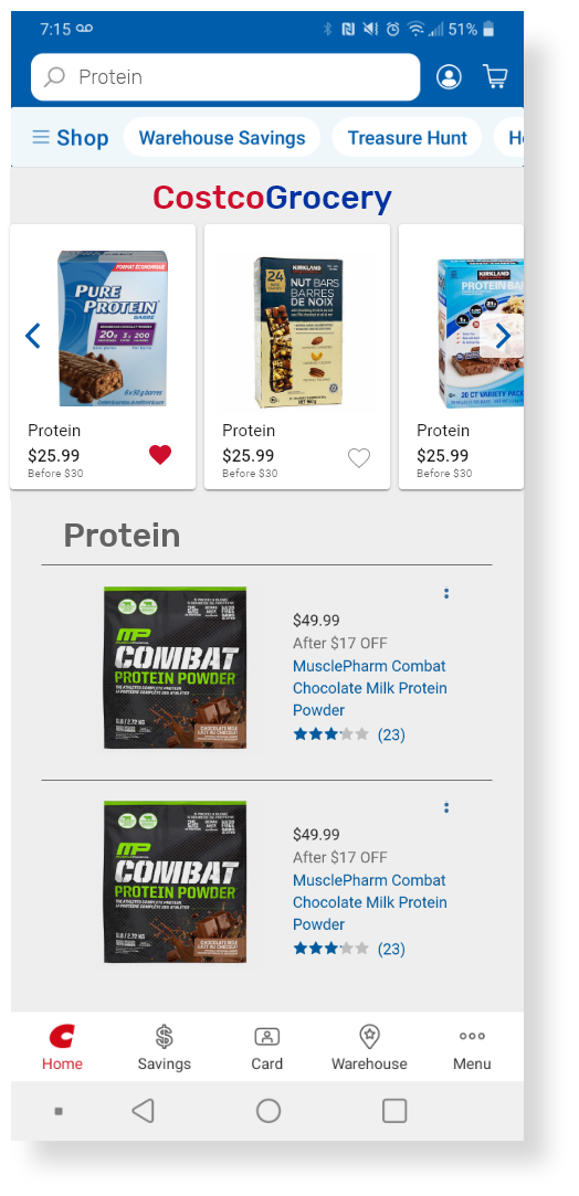
The application is only available in English but offers services in Quebec and Puerto Rico, where the offcial languages are French and Spanish.
The basic notion of the app providing the user with the option to interact in their native language is missing.

Next

Un Break Cafe - Industrial Design
READ MORE

LET'S WORK TOGETHER!

Feel free to hit me up. I'm looking forward to hearing from you.

edison@casallas.design 

casallas.design@gmail.com

Montréal, Québec, Canada

2024 - Edison Casallas's UX  Design Portfolio - Québec, Canada.  All rights reserved

linkedin facebook pinterest youtube rss twitter instagram facebook-blank rss-blank linkedin-blank pinterest youtube twitter instagram