Case Study (UI Focused)

Move smarter and sustainable

Greenline is a mobile app designed to enhance daily commuting. The app allows users to share their private vehicles with others during their commute, promoting carpooling. Additionally, it offers tailored alternatives by connecting users with the most suitable public transportation options, helping them save time and money while improving overall mobility.

The Challenge

Design a user-friendly, intuitive application that offers an efficient alternative for smart mobility in dense, chaotic urban centers.

Primary Objectives

• Develop a brand identity.
• Create an attractive and intuitive user interface.
• Create the components along with their various variants.
• Create mockups for different user flows.

My Approach

In line with my commitment to sustainable development, I contributed to bringing the Greenline project to life by creating its visual identity and designing the application interface.

Inspiration and color selection

Based on Greenline's core principles, I drew inspiration from natural elements, focusing on a cool, marine-inspired color palette contrasted with the warm tones of beach sand and complemented by the timeless elegance of white. My goal was to prioritize sobriety, tranquility, and a sense of natural beauty.

Logotype

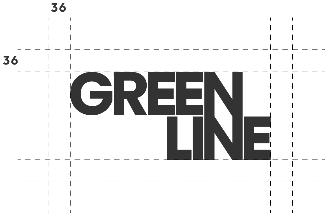
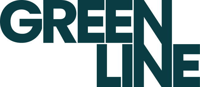
The logo I designed is an example of minimalist typography, where the simplicity of forms and the use of a clean and legible font allow for clear and direct communication of the brand's essence. The choice of minimalism was made with the intention of removing any unnecessary elements, leaving only what is essential to ensure that the message is easy to understand and remember. This approach allows the visual identity to be modern and timeless, while maintaining a strong connection to the brand's image.

Logo options

Logo selected

Typography

I chose the Outfit typeface because it follows the same principles of simplicity and clarity that I wanted to reflect in the logo design. Outfit is a geometric and modern font that stands out for its legibility and clean design. Its well-defined lines and balanced structure help maintain a minimalist aesthetic, aligned with the visual identity we are aiming for. Additionally, this typeface brings a contemporary touch that reinforces the idea of a sophisticated and professional design.

Components

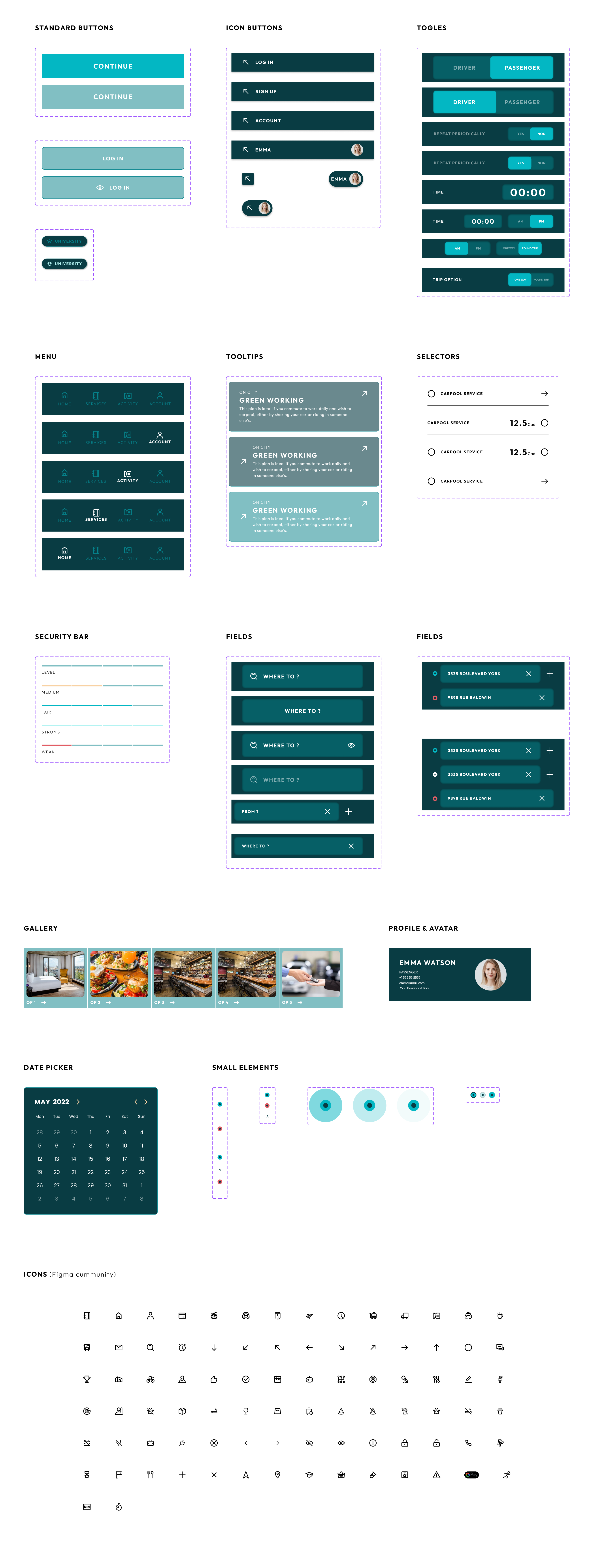
I designed and implemented a diverse range of components across the mockups, including variations for buttons, tooltips, toggles, icons, and more. Each component was meticulously crafted to address the specific needs of the interface. Additionally, I integrated several accessibility principles to enhance inclusivity and functionality. This involved selecting a suitable typeface, employing appropriate font sizes, and ensuring optimal contrast between elements—all with the aim of creating a user-friendly interface that is accessible to everyone.

Sketches

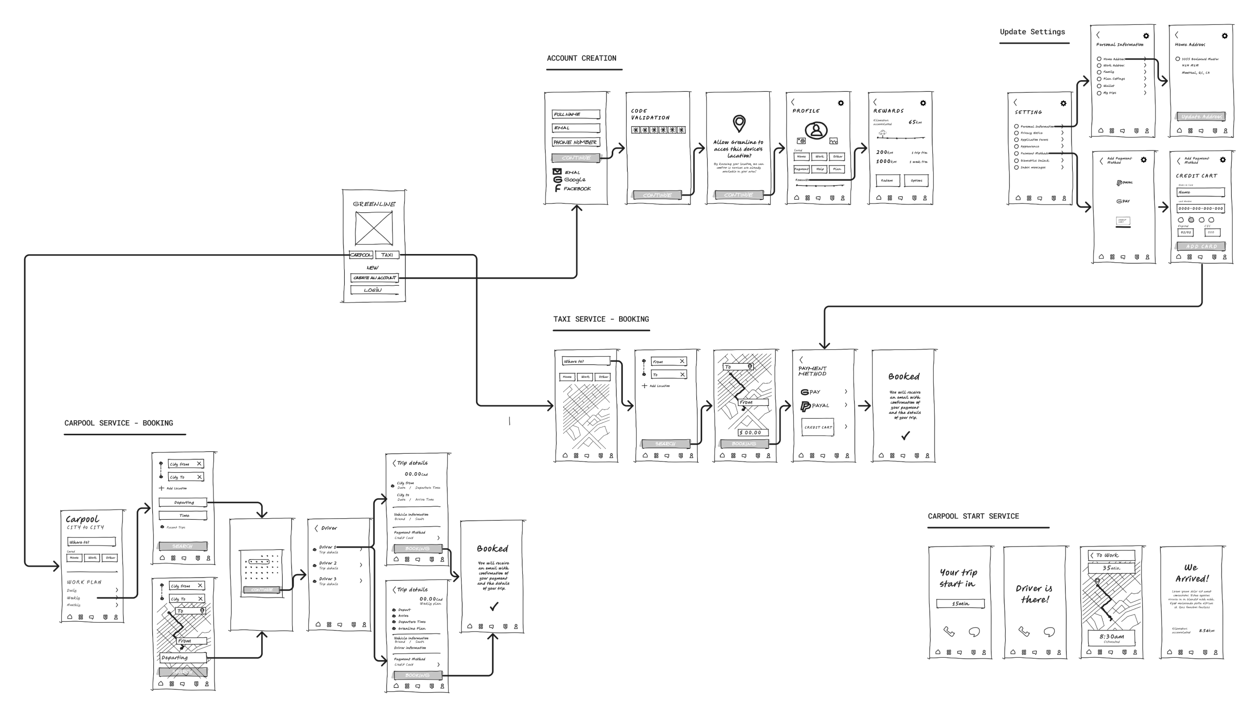
This is the final version of the wireframes I developed. I used this flow to create the mockups and prototypes, focusing on the processes for account creation, subscription to a plan, and searching for a service in Greenline.

Mockups

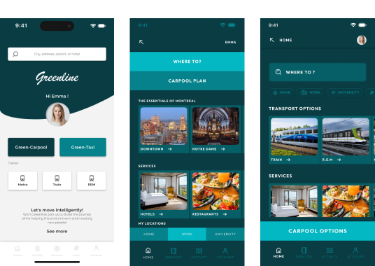
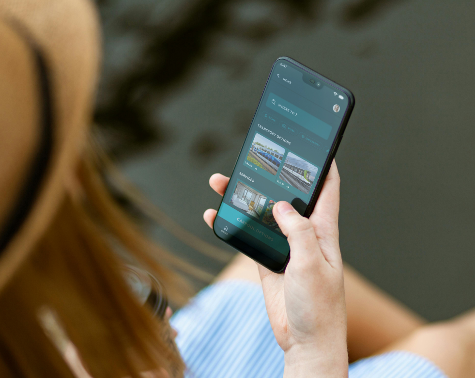
I refined my mockups through several iterations. At first, it was challenging to find the right direction, but after experimenting with different options, I landed on a solution that best matched the product’s visual identity and functionality. I added images to boost clarity and messaging, and optimized user flows for a smoother, more intuitive experience. This process also helped me fine-tune the color palette, making sure it perfectly aligned with the components. In the end, I created a visual concept that’s clean, vibrant, and informative. The prototype is now ready for testing

Iterations

Steps to take a service

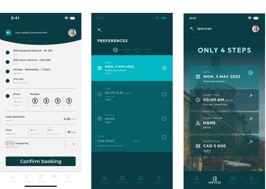
In the first iteration, I aimed for a dynamic visual but ended up overcrowding the interface with too much information, which wasn’t effective. So, I shifted to a more minimalist and light concept. However, it felt too cold, so I brought the user closer to the city by incorporating photos I took in Montreal that summer. These images breathed life into the prototype, giving it a distinctive identity.

Home Page

Similar to the previous example, my first iteration was functional but lacked clear information. To address this, I added city photos to create an instant connection between users, the service, and their desired destination. In the second iteration, I noticed that the buttons might be confusing, so I made sure to highlight the most important one.

Take away

Working on this project has been incredibly rewarding. I've not only enhanced my UI skills but also gained a deeper understanding of the challenges associated with mobility in congested cities. Although the project is ongoing, I'm currently focused on the upcoming phases, including developing animated prototypes for usability testing.

Next project 

Feel free to hit me up. 
I'm looking forward to hearing from you!

casallas.design@gmail.com

Montréal, Québec, Canada
2024 - Edison Casallas's UX Design Portfolio - Québec, Canada. All rights reserved